Overview
Teaching: 45 min
Exercises: 20 minQuestions
How can I create publication-quality graphics in R?
Objectives
To be able to use ggplot2 to generate publication quality graphics.
To understand the basic grammar of graphics, including the aesthetics and geometry layers, adding statistics, transforming scales, and coloring or panelling by groups.
Plotting our data is one of the best ways to quickly explore it and the various relationships between variables.
There are three main plotting systems in R, the base plotting system, the lattice package, and the ggplot2 package.
Today we’ll be learning about the ggplot2 package, because it is the most effective for creating publication quality graphics.
ggplot2 is built on the grammar of graphics (where the gg comes from), the idea that any plot can be expressed from the same set of components: a data set, a coordinate system, and a set of geoms–the visual representation of data points.
The key to understanding ggplot2 is thinking about a figure in layers. This idea may be familiar to you if you have used image editing programs like Photoshop, Illustrator, or Inkscape.
Let’s start off with an example. The first thing we need to do is load the ggplot2 package, just
like we did with the previous ones:
library("ggplot2")
In order to begin graphing, we use the ggplot function. This function lets R
know that we’re creating a new plot, and any of the arguments we give the
ggplot function are the global options for the plot: they apply to all
layers on the plot.
By itself, the call to ggplot isn’t enough to draw a figure:
ggplot(data = gapminder, aes(x = gdpPercap, y = lifeExp))

We need to tell ggplot how we want to visually represent the data, which we
do by adding a new geom layer. In our example, we used geom_point, which
tells ggplot we want to visually represent the relationship between x and
y as a scatterplot of points:
ggplot(data = gapminder, aes(x = gdpPercap, y = lifeExp)) +
  geom_point()

We’ve passed in two arguments to ggplot. First, we tell ggplot what data we
want to show on our figure, in this example the gapminder data we read in
earlier. For the second argument we passed in the aes function, which
tells ggplot how variables in the data map to aesthetic properties of
the figure, in this case the x and y locations. Here we told ggplot we
want to plot the “gdpPercap” column of the gapminder data frame on the x-axis, and
the “lifeExp” column on the y-axis. Notice that we didn’t need to explicitly
pass aes these columns (e.g. x = gapminder[, "gdpPercap"]), this is because
ggplot is smart enough to know to look in the data for that column!
Other options that can be set with the aes function include color, size, transparency and shape. We will talk more about that later.
Challenge 1
Our example visualizes how the GDP per capita changes in relationship to life expectancy:
ggplot(data = gapminder, aes(x = gdpPercap, y = lifeExp)) + geom_point()Modify this example so that the plot visualizes how life expectancy has changed over time:
Hint: the gapminder dataset has a column called “year”, which should appear on the x-axis.
Solution to Challenge 1
Modify the example so that the figure visualise how life expectancy has changed over time:
ggplot(data = gapminder, aes(x = year, y = lifeExp)) + geom_point()

Challenge 2
In the previous examples and challenge we’ve used the
aesfunction to tell the scatterplot geom about the x and y locations of each point. Another aesthetic property we can modify is the point color. Modify the code from the previous challenge to color the points by the “continent” column. What trends do you see in the data? Are they what you expected?Solution to Challenge 2
In the previous examples and challenge we’ve used the
aesfunction to tell the scatterplot geom about the x and y locations of each point. Another aesthetic property we can modify is the point color. Modify the code from the previous challenge to color the points by the “continent” column. What trends do you see in the data? Are they what you expected?ggplot(data = gapminder, aes(x = year, y = lifeExp, color=continent)) + geom_point()

Layers
Using a scatterplot probably isn’t the best for visualizing change over time.
Instead, let’s tell ggplot to visualize the data as a line plot:
ggplot(data = gapminder, aes(x=year, y=lifeExp, by=country, color=continent)) +
  geom_line()

Instead of adding a geom_point layer, we’ve added a geom_line layer. We’ve
added the by aesthetic, which tells ggplot to draw a line for each
country.
But what if we want to visualize both lines and points on the plot? We can simply add another layer to the plot:
ggplot(data = gapminder, aes(x=year, y=lifeExp, by=country, color=continent)) +
  geom_line() + geom_point()

It’s important to note that each layer is drawn on top of the previous layer. In this example, the points have been drawn on top of the lines. Here’s a demonstration:
ggplot(data = gapminder, aes(x=year, y=lifeExp, by=country)) +
  geom_line(aes(color=continent)) + geom_point()

In this example, the aesthetic mapping of color has been moved from the
global plot options in ggplot to the geom_line layer so it no longer applies
to the points. Now we can clearly see that the points are drawn on top of the
lines.
Tip: Setting an aesthetic to a value instead of a mapping
So far, we’ve seen how to use an aesthetic (such as color) as a mapping to a variable in the data. For example, when we use
geom_line(aes(color=continent)), ggplot will give a different color to each continent. But what if we want to change the colour of all lines to blue? You may think thatgeom_line(aes(color="blue"))should work, but it doesn’t. Since we don’t want to create a mapping to a specific variable, we simply move the color specification outside of theaesfunction, like this:geom_line(color="blue").
We can further demonstrate this point by switching the order of the point and line layers from the previous example.
ggplot(data = gapminder, aes(x=year, y=lifeExp, by=country)) +
   geom_point() + geom_line(aes(color=continent))

The lines now get drawn over the points!
Transformations and statistics
ggplot also makes it easy to overlay statistical models over the data. To
demonstrate we’ll go back to our first example:
ggplot(data = gapminder, aes(x = gdpPercap, y = lifeExp)) +
  geom_point()

Currently it’s hard to see the relationship between the points due to some strong outliers in GDP per capita. We can change the scale of units on the x axis using the scale functions. These control the mapping between the data values and visual values of an aesthetic. We can also modify the transparency of the points, using the alpha function, which is especially helpful when you have a large amount of data which is very clustered.
ggplot(data = gapminder, aes(x = gdpPercap, y = lifeExp)) +
  geom_point(alpha = 0.5) + scale_x_log10()

The log10 function applied a transformation to the values of the gdpPercap
column before rendering them on the plot, so that each multiple of 10 now only
corresponds to an increase in 1 on the transformed scale, e.g. a GDP per capita
of 1,000 is now 3 on the y axis, a value of 10,000 corresponds to 4 on the y
axis and so on. This makes it easier to visualize the spread of data on the
x-axis.
Tip Reminder: Setting an aesthetic to a value instead of a mapping
Notice that we used
geom_point(alpha = 0.5). As the previous tip mentioned, using a setting outside of theaesfunction will cause this value to be used for all points, which is what we want in this case. But just like any other aesthetic setting, alpha can also be mapped to a variable in the data. For example, we can give a different transparency to each continent withgeom_point(aes(alpha = continent)).
We can fit a simple relationship to the data by adding another layer,
geom_smooth:
ggplot(data = gapminder, aes(x = gdpPercap, y = lifeExp)) +
  geom_point() + scale_x_log10() + geom_smooth(method="lm")

We can make the line thicker by setting the size aesthetic in the
geom_smooth layer:
ggplot(data = gapminder, aes(x = gdpPercap, y = lifeExp)) +
  geom_point() + scale_x_log10() + geom_smooth(method="lm", size=1.5)

There are two ways an aesthetic can be specified. Here we set the size
aesthetic by passing it as an argument to geom_smooth. Previously in the
lesson we’ve used the aes function to define a mapping between data
variables and their visual representation.
Challenge 3
Modify the color and size of the points on the point layer in the previous example.
Hint: do not use the
aesfunction, change this by adding arguments to the correct function.Solution to Challenge 3
Since we want all the points to be the same and are not making this aesthetic specific to the data, we add this to
geom_pointto make the change effect all points but not the line.ggplot(data = gapminder, aes(x = gdpPercap, y = lifeExp)) + geom_point(size=3, color="orange") + scale_x_log10() + geom_smooth(method="lm", size=1.5)

Challenge 4
Modify your solution to Challenge 3 so that the points are now a different shape and are colored by continent with new trendlines.
Hint: The color argument can be used inside the aesthetic. To change the shape of a point, use the
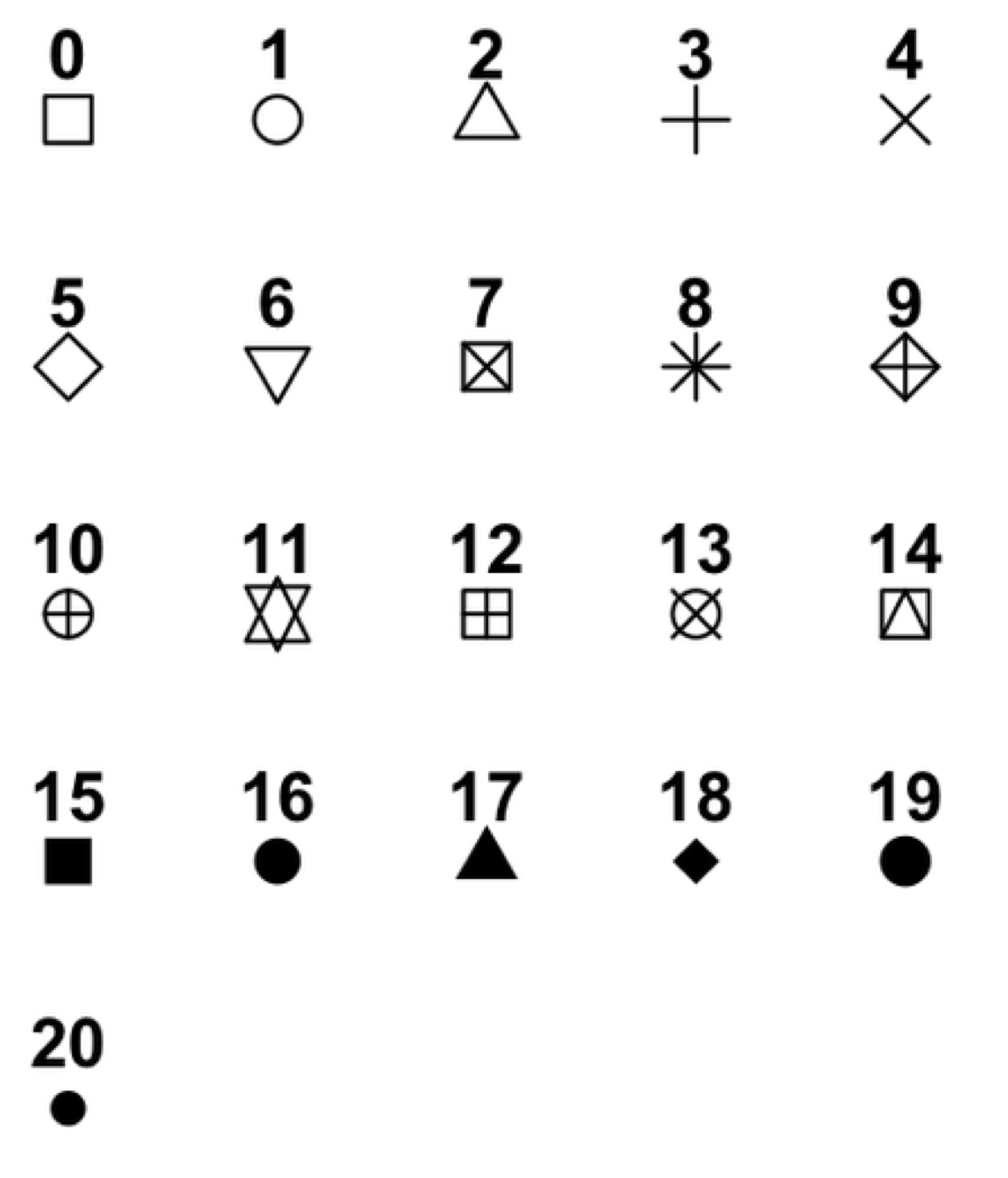
pchargument. Settingpchto different numeric values from1:25yields different shapes as indicated in the chart below.
Solution to Challenge 4
Since we want the color to be dependent on the continent, we place that argument inside the
aes. To change the shape of the point, we place thepchargument insidegeom_point.ggplot(data = gapminder, aes(x = gdpPercap, y = lifeExp, color = continent)) + geom_point(size=3, pch=17) + scale_x_log10() + geom_smooth(method="lm", size=1.5)

Multi-panel figures
Earlier we visualized the change in life expectancy over time across all countries in one plot. Alternatively, we can split this out over multiple panels by adding a layer of facet panels. Focusing only on those countries with names that start with the letter “A” or “Z”.
We start by subsetting the data. We use the substr function to
pull out a part of a character string; in this case, the letters that occur
in positions start through stop, inclusive, of the gapminder$country
vector. As we saw previously, the %in% operator allows us to make multiple comparisons rather
than write out long subsetting conditions (in this case,
starts.with %in% c("A", "Z") is equivalent to
starts.with == "A" | starts.with == "Z")
starts.with <- substr(gapminder$country, start = 1, stop = 1)
az.countries <- gapminder[starts.with %in% c("A", "Z"), ]
ggplot(data = az.countries, aes(x = year, y = lifeExp, color=continent)) +
  geom_line() + facet_wrap( ~ country)

The facet_wrap layer takes a “formula” as its argument, denoted by the tilde
(~). This tells R to draw a panel for each unique value in the country column
of the gapminder dataset.
Modifying text
To clean this figure up for a publication we need to change some of the text elements.
First, let’s rename our x and y axes to neater and more informative labels. We can do that using the xlab and ylab functions:
ggplot(data = az.countries, aes(x = year, y = lifeExp, color=continent)) +
  geom_line() + facet_wrap( ~ country) +
  xlab("Year") + ylab("Life Expectancy")

Let’s give our figure a title with the ggtitle function. And while we’re at it, let’s capitalize the label of our
legend. This can be done using the scales layer.
ggplot(data = az.countries, aes(x = year, y = lifeExp, color=continent)) +
  geom_line() + facet_wrap( ~ country) +
  xlab("Year") + ylab("Life Expectancy") +
  ggtitle("Figure 1") + scale_colour_discrete(name="Continent")

Lastly, let’s remove the x-axis labels so the plot is less cluttered. To do this, we use the theme layer which controls the axis text and overall text size.
ggplot(data = az.countries, aes(x = year, y = lifeExp, color=continent)) +
  geom_line() + facet_wrap( ~ country) +
  xlab("Year") + ylab("Life Expectancy") +
  ggtitle("Figure 1") + scale_colour_discrete(name="Continent") +
  theme(axis.text.x=element_blank(), axis.ticks.x=element_blank())

This is a taste of what you can do with ggplot2. RStudio provides a
really useful cheat sheet of the different layers available, and more
extensive documentation is available on the ggplot2 website.
Finally, if you have no idea how to change something, a quick Google search will
usually send you to a relevant question and answer on Stack Overflow with reusable
code to modify!
Challenge 5
Create a density plot of GDP per capita, filled by continent.
Advanced Challenge:
- Transform the x axis to better visualise the data spread.
- Add a facet layer to panel the density plots by year.
Solution to Challenge 5
Create a density plot of GDP per capita, filled by continent.
ggplot(data = gapminder, aes(x = gdpPercap, fill=continent)) +
 geom_density(alpha=0.6)
Advanced:
- Transform the x axis to better visualise the data spread.
- Add a facet layer to panel the density plots by year.
ggplot(data = gapminder, aes(x = gdpPercap, fill=continent)) +
 geom_density(alpha=0.6) + facet_wrap( ~ year) + scale_x_log10()


Key Points
Use
ggplot2to create plots.Think about graphics in layers: aesthetics, geometry, statistics, scale transformation, and grouping.